
A price label can look clean in an image editor and acquire a dirty outline after export. A thin blue curve can lose its color, while a textured background becomes smoother. These changes can happen even when the exported image has exactly the same width and height as the original.
The useful question is not simply whether an image is smaller in bytes. It is which details changed, and whether those details matter to the person viewing it. In our original test card, lossy exports changed small lettering and other fine detail. Two lossless exports preserved every decoded RGB pixel. Compression did not have one inevitable visual result.
Here is what the comparison showed, how it differs from resizing, and a practical way to check your own images before sharing them.
1. Compression and resizing change different things
Resizing changes the pixel dimensions of an image. Reducing a 1280-pixel-wide image to 640 pixels requires representing its content with fewer pixels. A tiny letter that was only a few pixels wide has less room for its strokes.
Compression concerns how image data is encoded into a file. Lossless encoding can reduce file size while preserving the pixel values. Lossy encoding allows changes to those values in exchange for a smaller representation. Neither requires changing the width or height. A website can also display an image at a different size from its stored dimensions, introducing another scaling step.
Those processes can occur together, but they should not be confused. Every sample below is 1280 × 960 pixels, exported directly from the same opaque RGB source. There was no resizing between samples and no chain of repeated JPEG saves. The differences belong to these encoding paths, not to a reduction in image dimensions.
2. One original card, six actual files
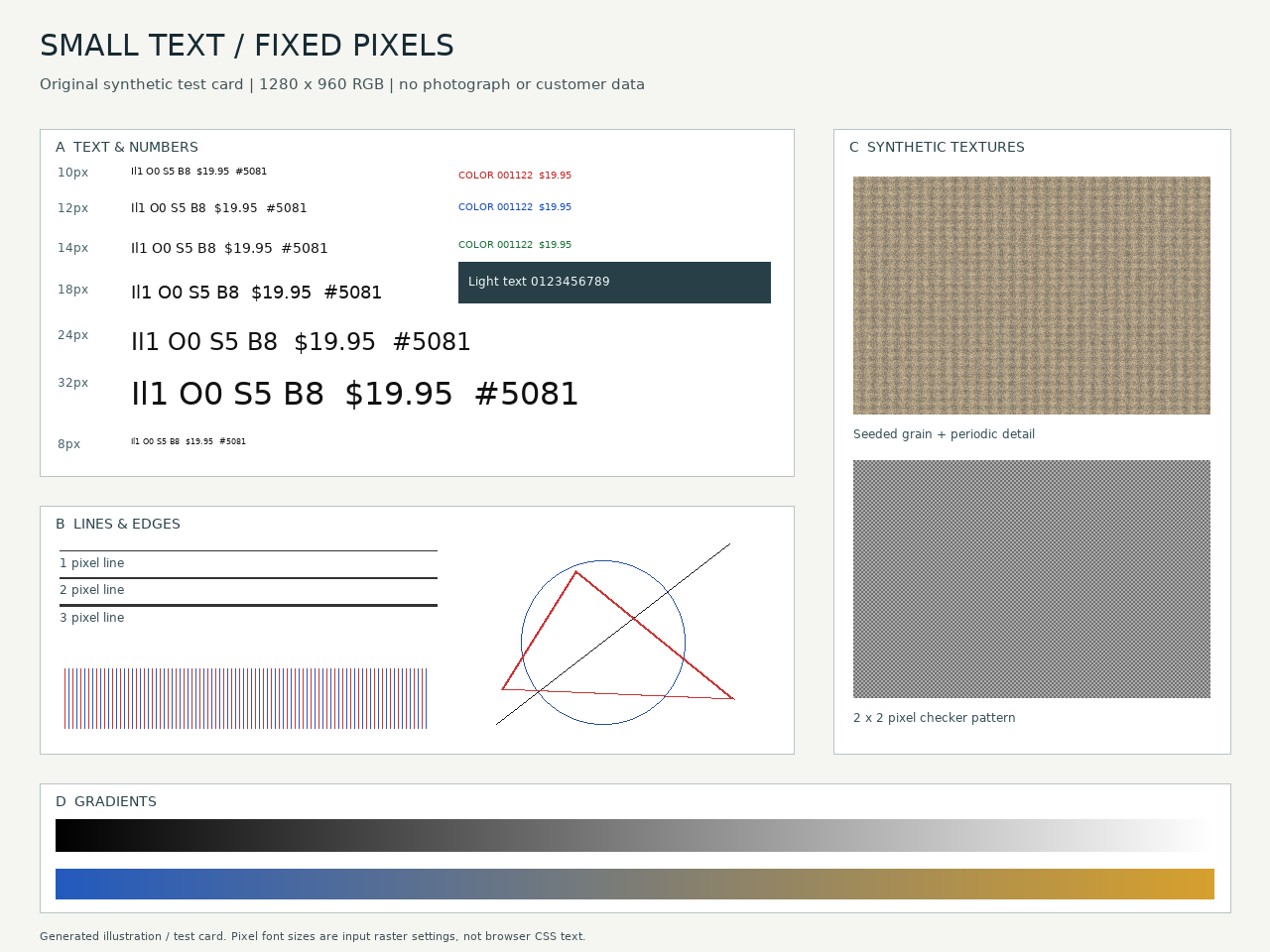
We made a synthetic test card with text and numbers at 8, 10, 12, 14, 18, 24 and 32 raster pixels; colored lettering; one-, two- and three-pixel lines; geometric edges; gradients; seeded grain; and a checker pattern. These are generated illustrations, not photographs or a screenshot of a product. The font is DejaVu Sans Book 2.37, used with its license notices retained in the experiment package.
Inspect image at full size
The overview is reduced to fit. This view keeps the original image dimensions. Scroll inside the image, or focus its frame and use arrow keys.
F1. The full source card. This inline preview may be scaled by your screen. Open the source PNG when checking image pixels rather than the page layout.
The main comparison uses four files:
- PNG lossless: 275,162 bytes; decoded RGB pixels identical to the source.
- JPEG, 48 KiB target: 49,437 bytes; lossy.
- WebP lossy, 48 KiB target: 49,172 bytes.
- WebP lossless: 144,068 bytes; decoded RGB pixels identical to the source.
The JPEG/WebP lossy pair differs by 265 bytes, about 0.54% of their mean size. That is a useful near-size comparison, not an exact byte match. Files were chosen by their distance from the byte target, not by how flattering they looked.
Matching quality-slider numbers would not make a fair comparison: they are not a shared quality scale. These exports also handle color differently. We are comparing complete export paths, not isolating one compression mechanism. The exact settings and a smaller-budget attempt are documented in the method below.
In F2–F6, each crop uses the same source coordinates. Its pixels are enlarged 2× with nearest-neighbor sampling, which adds no smoothing. The composite graphics are PNG presentations of the decoded crops; their labels report the full encoded sample's byte count. They are not screenshots and their own PNG file sizes are not the export sizes. Inline display can shrink them: open the figure at its intrinsic size to inspect the stated enlargement.
3. Small text exposes more than blur
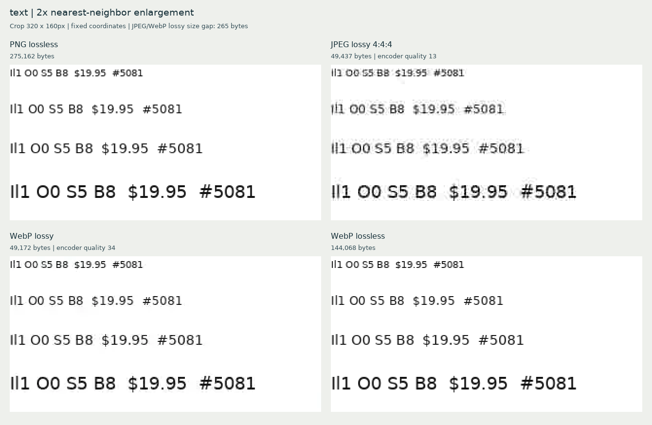
Look first at the white space immediately around a letter, then at the thin strokes within it. In this card's near-size pair, the JPEG has gray mottling and fringes around the black text. The WebP lossy sample keeps a cleaner white background in this region, but it is still not pixel-identical to the reference.
Inspect image at full size
The overview is reduced to fit. This view keeps the original image dimensions. Scroll inside the image, or focus its frame and use arrow keys.
F2. Black lettering at 10, 12, 14 and 18 source pixels. Open the full comparison. Larger letters provide more pixels to describe their shapes; that observation is not a measured improvement in reading accuracy.
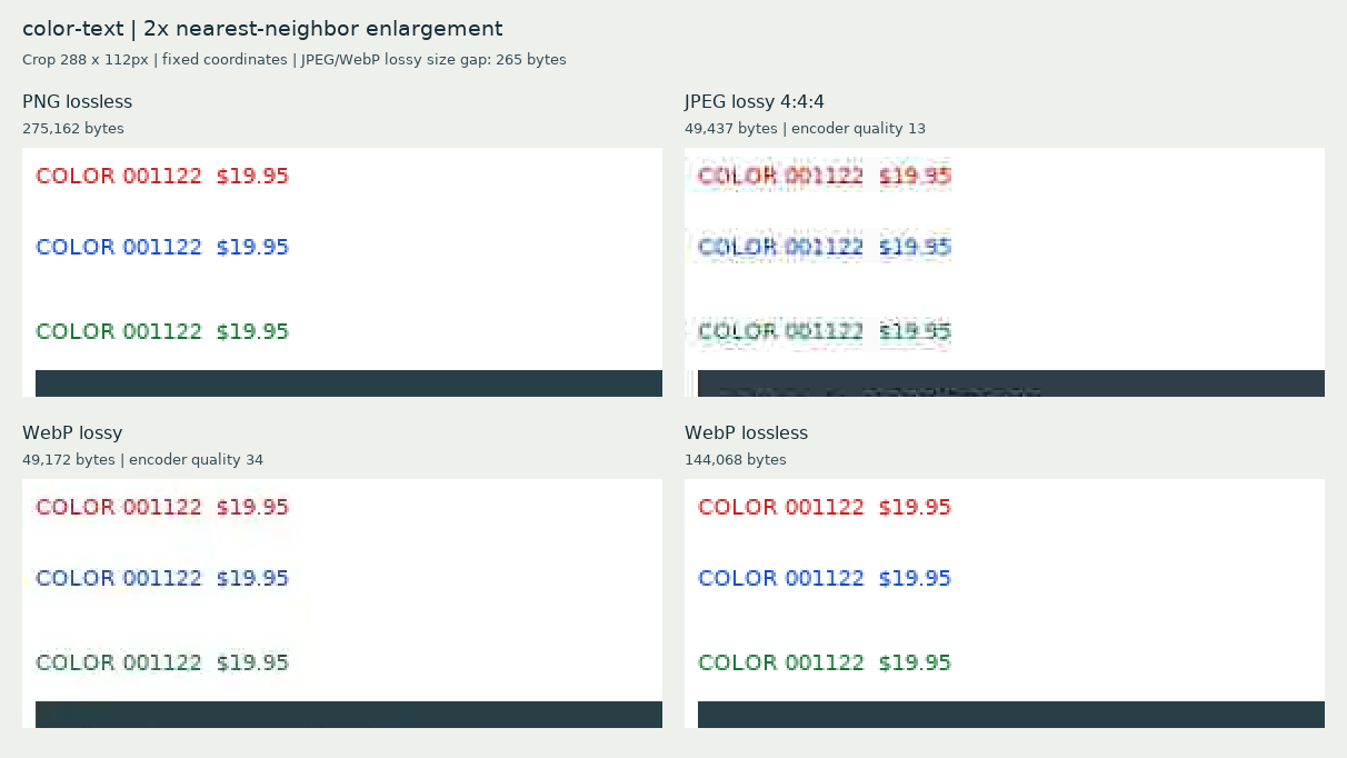
The colored lettering adds another test. Fringes can make a letter look dirty even when its outline remains recognizable. In our JPEG crop, colored strokes acquire surrounding artifacts. The lossy WebP crop also softens or changes colored detail; its cleaner appearance around black text does not establish that it preserves every kind of edge.
Inspect image at full size
The overview is reduced to fit. This view keeps the original image dimensions. Scroll inside the image, or focus its frame and use arrow keys.
F3. Colored lettering and light text on a dark field. Open the full comparison. Check both the stroke and the pixels beside it.
Lossy encoders can approximate high-frequency detail: sharp changes over small distances, such as a narrow dark stroke next to a white background. The resulting changes may look like softening, speckles or a halo. Color sampling can affect fine colored boundaries as well. These are useful explanations for what to inspect, not a proof assigning each visible artifact to a single internal encoding step.
We did not ask people to read these samples or measure mistakes, recognition speed or accessibility. The comparison supports statements about visible pixel changes, not claims about how accurately readers can identify a price or a character.
4. Lines, gradients and texture reveal other compromises
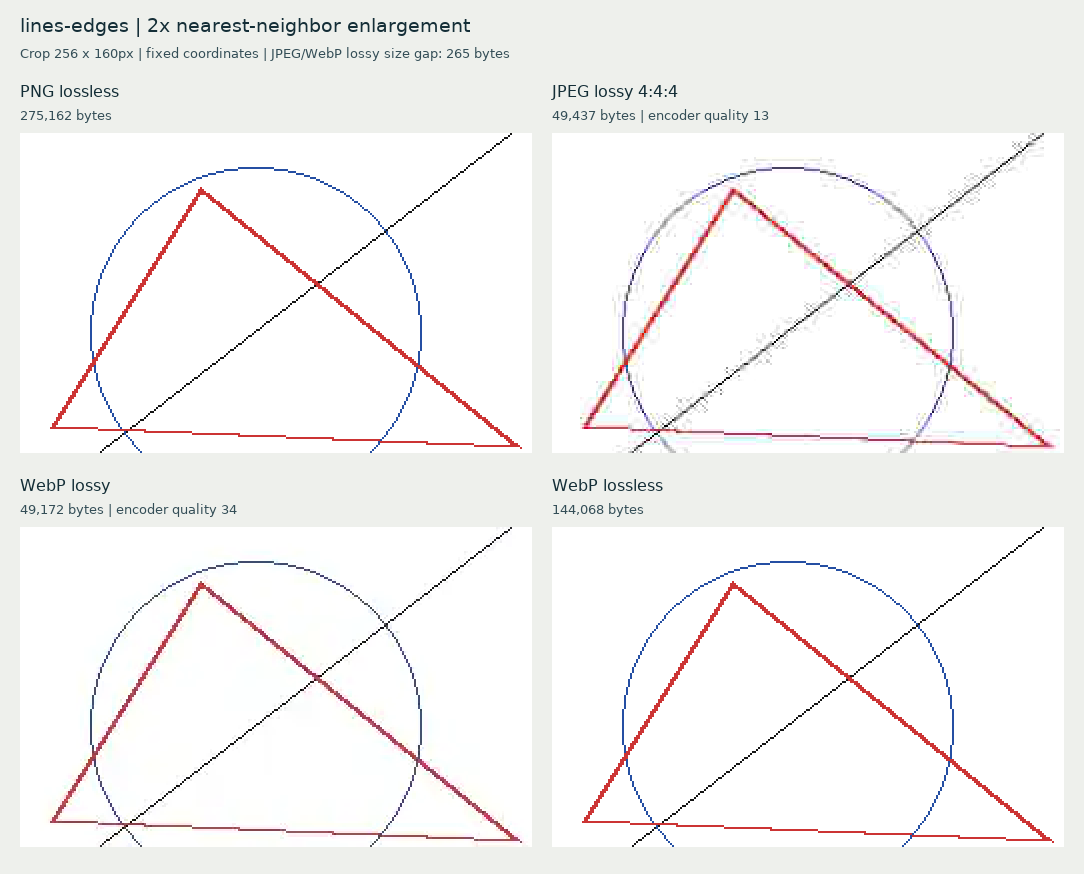
Text is only one test. In the edge crop, the narrow blue circle becomes darker and less distinctly blue in the lossy WebP export. The JPEG has different edge noise. Choosing a file on the black-text crop alone would miss this tradeoff.
Inspect image at full size
The overview is reduced to fit. This view keeps the original image dimensions. Scroll inside the image, or focus its frame and use arrow keys.
F4. Fine colored and diagonal boundaries. Open the full comparison.
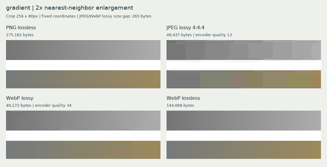
The gradient asks a different question: does a smooth transition remain smooth? This JPEG crop introduces visible steps and patches into the gray ramp. The WebP lossy ramp also differs from the source, even where the change is less conspicuous. A clean logo edge does not tell you how a background gradient survived.
Inspect image at full size
The overview is reduced to fit. This view keeps the original image dimensions. Scroll inside the image, or focus its frame and use arrow keys.
F5. The same section of the gray ramp. Open the full comparison.
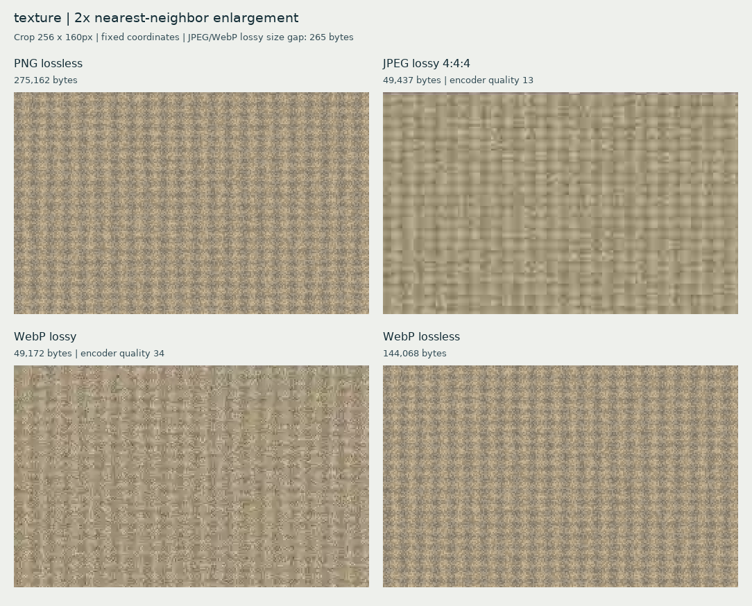
The synthetic grain shows why a smaller file can seem smoother without preserving the original detail. In the JPEG, fine grain becomes softer, with larger patterned patches. The lossy WebP changes the pattern in another way, leaving a different distribution of speckles. Neither reproduces the original grain exactly. A viewer might prefer a smoother result, but preference and fidelity are separate judgments.
Inspect image at full size
The overview is reduced to fit. This view keeps the original image dimensions. Scroll inside the image, or focus its frame and use arrow keys.
F6. Synthetic texture, not photographic skin, fabric or foliage. Open the full comparison. This example does not establish how either encoder handles every photograph.
5. Choose a compromise around the detail you need
For this source, PNG and WebP lossless decode to exactly the same RGB pixels. The WebP lossless file is smaller here, but both are larger than the roughly 49 KB lossy pair. Those are measured results for one card and these settings, not universal size ratios or a format ranking.
If exact small lettering or line color matters, compare a lossless export before deciding the extra bytes are unacceptable. If a strict delivery limit matters more, inspect the lossy candidate at that limit. Do not assume a quality slider's number tells you what survived.
It can also help to revisit the source design. If a label is already difficult to distinguish in the original, compression cannot restore information that was never clearly represented. Larger text or a less delicate line may be a better starting point, though this experiment did not test a redesign or establish a minimum readable font size.
On a website, keep important words as real page text where practical. This card deliberately contains rasterized text so that its pixels can be compared; it is not a recommendation to turn all text into images.
6. A short check before you share
- Separate dimensions from bytes. Record the original and exported width and height. If they changed, account for resizing before attributing everything to compression.
- Inspect image pixels and the intended display size. Start with a viewer setting that maps one image pixel to one displayed image pixel, rather than fit-to-window; confirm what that setting means on your browser and display. Then check the actual size your audience will see. A labeled enlarged crop helps find artifacts but is not a simulation of ordinary reading.
- Check the fragile regions. Look at the smallest important numbers, colored strokes, thin diagonals, flat areas beside text, gradients and texture. The most flattering region is not enough.
- Compare at a relevant file budget. Use actual bytes, not matching slider values. Keep an untouched source and export each candidate from it.
- Check the delivered image. If you upload it elsewhere, examine the result there too. This experiment did not test platform recompression or a social site's resizing pipeline.
A satisfactory export is one whose changes are acceptable for its purpose. This card shows why that decision benefits from checking several kinds of detail, rather than treating “smaller” or “sharper-looking” as a complete verdict.
Method and sources
This is an original synthetic-card experiment with static visual inspection, not a human reading study. It covers one opaque, unprofiled RGB source, specific encoder versions and unusually small lossy budgets for a detailed card. It does not test transparency, color-profile workflows, every browser, photographs, encoding speed or repeated exports. Reproduction requires the recorded font, script, seed and software environment; other versions may produce different encoded bytes.
The files were encoded with Pillow 13.0.0, libjpeg-turbo 3.2.0 and libwebp 1.6.0. PNG used compression level 9. The main JPEG used quality 13, 4:4:4 chroma, optimized and non-progressive encoding. The main lossy WebP used quality 34 and method 4. Lossless WebP used lossless enabled, quality 100 and method 6; here quality controls compression effort, not permission to discard pixels. Lossy WebP uses Y′CbCr 4:2:0, unlike this JPEG's 4:4:4. JPEG 13 and WebP 34 are not equivalent quality levels.
We searched the recorded integer quality settings for the file nearest each byte target, independently for each encoder. Appearance was not used to select the files. An auxiliary 24 KiB target produced a 24,484-byte JPEG at quality 2 with the same JPEG options, and a 27,424-byte lossy WebP at quality 5 and method 4. The pair differs by 2,940 bytes, about 11.3% of its mean size, so it is retained as a stress example rather than an equal-size contest. F2–F6 use the main 48 KiB-target files throughout.
The research package retains the source PPM and PNG, generator, encoder search log, native crops, selected samples, exact parameters and SHA-256 manifests. Its reproducibility check regenerated all six selected encoded files byte-for-byte and verified all 30 native crops. PNG and WebP lossless decoded RGB hashes match the source; lossy RGB hashes do not.
- Pillow: JPEG and WebP file-format options explains the encoder settings used here.
- Google: WebP compression techniques explains the distinction between lossy and lossless coding.
- Google: WebP FAQ, supported color spaces documents lossy WebP's 4:2:0 color sampling.
- MDN: Image file type and format guide provides format background.
- DejaVu Fonts license provides the font-use terms; the actual font's embedded license and notices are retained locally.
Disclosure: The experiment card, comparison graphics, scripts, writing and preview were prepared with AI assistance. The sample exports and file measurements are actual generated files. No stock photograph, NASA image, W3C test image or customer material was used. No search-performance outcome is claimed.