
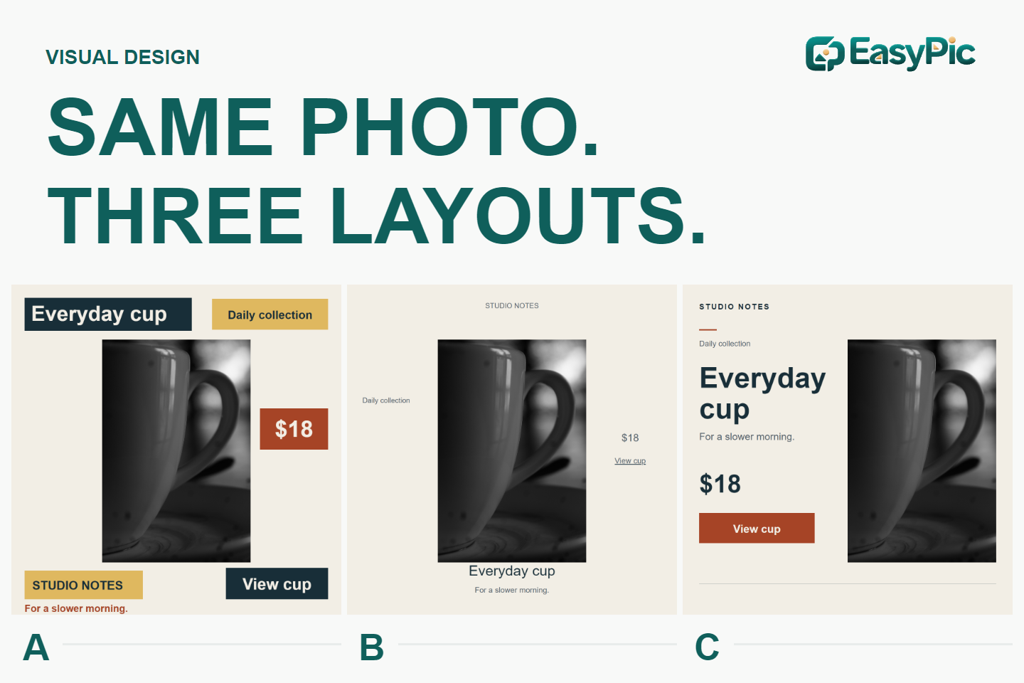
You have a product photograph, a name, a price and a link. Put them on a square card and the job looks almost finished. Then shrink that card to the width of a phone feed. Can someone still find what the item is, what it costs and where to go next?
We made three layouts with the same photograph, copy and image scale. The comparison below explores how positioning, type and spacing change the emphasis. These are editorial observations, not results from a user study; we did not measure attention, preference, clicks or sales.
What stayed the same
Each card uses a 1200 × 1200-pixel canvas and the same unretouched photograph at 540 × 810 pixels. We changed its position, not its size, framing or brightness. All three use Arial and the same available six-color palette.
The six copy items are identical: STUDIO NOTES, Everyday cup, For a slower morning., Daily collection, $18 and View cup.
The label, price and offer are fictional. The photograph is a third-party close-up, not an EasyPic product shoot. It does not establish a model, capacity, material specification or real price, and it does not show the whole cup.
A: Several things ask for emphasis
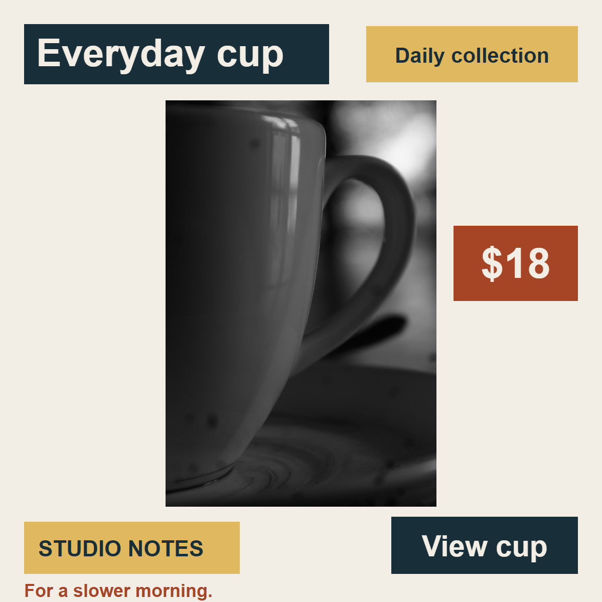
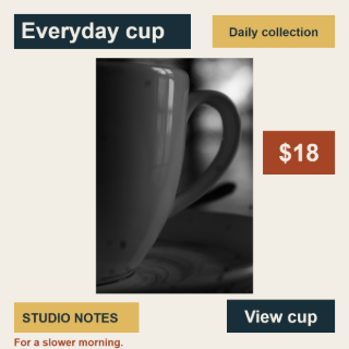
A — Dispersed emphasis. Original export: 1200 × 1200 pixels.
A puts strong backgrounds behind the name, collection, brand, price and action. Important words remain visible, but several areas use the same visual language of importance.
In our reading, the collection and brand panels compete with the details needed to understand the offer. The name, price and action occupy separate regions, while the tagline stays small along the bottom.
A price-led promotion might reasonably use a badge, and a recognizable brand might deserve emphasis. Our rejected choice here is the number of competing treatments. If price were the point, we would keep its badge and quiet the collection and brand. A remains in the comparison because that trade-off is useful to see.
B: The photo dominates without getting bigger
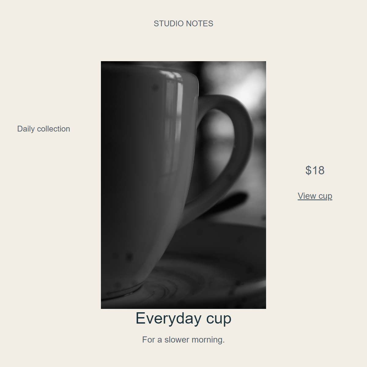
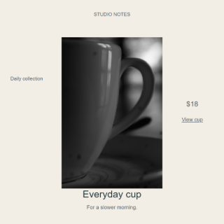
B — Product first. The photograph has exactly the same dimensions as A and C.
Centering the photograph, removing the surrounding panels and making the copy quieter gives the image greater prominence in our editorial reading. Image size and image emphasis are different decisions.
B may suit an image-led teaser when the product name, price and link are also supplied as accessible text nearby. It is weaker as a standalone offer: the small price and action sit away from the name, and supporting text becomes difficult to inspect at reduced sizes.
The close-up is a separate constraint. If a shopper needs the overall shape or a precise product detail, a more suitable source photograph matters more than further simplifying this layout.
C: Group the details, then leave them room
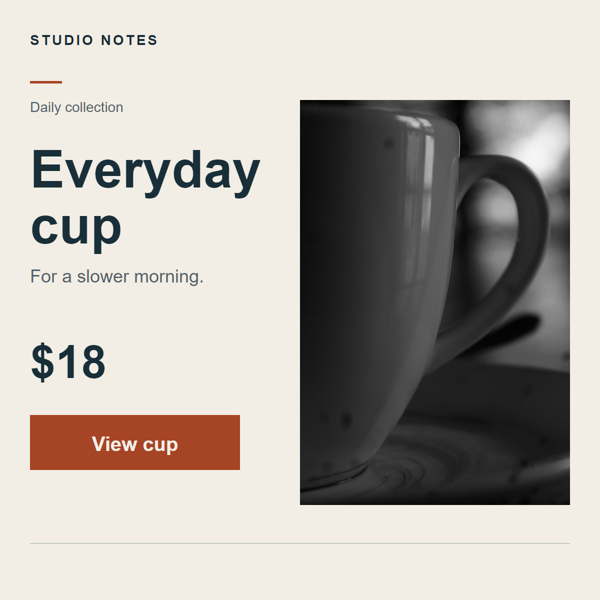
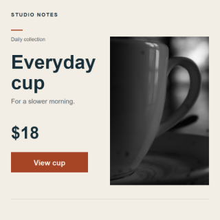
C — Grouped hierarchy. Larger type does not add information.
C aligns the name, price and action on the left. The name uses two lines, the collection stays small, and the strongest accent is concentrated on the action panel. Space separates the name and tagline from the price and action without sending them to distant corners.
For finding the name, price and next step together, C is our preferred starting point. The visible grouping and type sizes support that choice; they do not prove that it converts better.
There are costs. The large name competes with the photograph and depends on short copy. A longer name, another currency or a translation would need a fresh layout check. The collection and tagline also remain small. C does not make every detail equally readable.
Compare the real 320-pixel exports
The original experiment exported each card with the same browser settings and inspected it at 600 and 320 CSS pixels wide. Here is its saved 320-pixel comparison, reused without alteration.
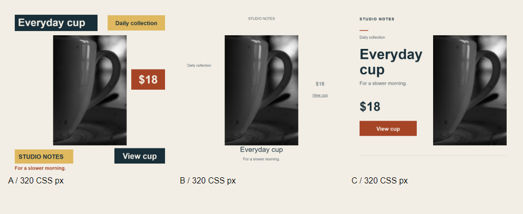
Captured at 320 pixels per card. This 1024 × 420 screenshot includes margins and labels. The overview scales to fit the article, so the cards may appear smaller here. Open the original comparison image to inspect the captured version.
The separate 320 × 320 exports below avoid squeezing all three cards into one row. Open an original image if your browser or display scales it.
A at 320 pixels
B at 320 pixels
C at 320 pixels
At 320 pixels, a 1200-pixel card is scaled to about 26.7% of its original width. Its nominal type sizes scale with it:
- A: the 76-pixel name becomes about 20.3 pixels; the 58-pixel action becomes about 15.5 pixels.
- B: the 52-pixel name becomes about 13.9 pixels; the 28-pixel action becomes about 7.5 pixels.
- C: the 104-pixel name becomes about 27.7 pixels; the 40-pixel action becomes about 10.7 pixels.
These are layout-scale calculations, not measured character heights or readability thresholds. B's quiet action becomes particularly small. C protects the name more strongly, but its action and supporting copy still need scrutiny. A keeps several elements large at the cost of competing emphasis.
If every detail must be readable, hierarchy alone may not be enough. Move supporting information into real page text, simplify the offer or design for a larger display slot. A high-resolution export cannot rescue text that is displayed too small.
A practical check for your next card
- Write the task in one sentence: show the product, make the price easy to find, or explain the offer.
- Display the card at its actual destination width. Check the name, price and next step individually.
- Ask whether a supporting label has received more emphasis than the information someone needs to make a decision.
- Keep a rejected version and note why. A exposes competing emphasis; B shows the cost of making all copy quiet. C is a starting point for this offer, with limits that remain visible.
Create the composition in a layout editor. Once it is approved, the existing batch product-image resizing tutorial covers the separate task of preparing delivery dimensions in EasyPic. EasyPic did not create the text layout, and we did not process these exports through its tools.
Keep essential product information and links as accessible page text wherever the destination allows it. “View cup” inside these images is a drawn label, not a working button.
Method and source notes
This experiment changes positioning, type size and weight, color emphasis and spacing together. It cannot isolate the effect of one variable. It covers one photograph, one short English offer and one square format. The display checks used desktop Chrome, not shoppers or physical phones. The original editable SVGs, PNG exports, parameters and display evidence were retained. No generative photo editing was used.
Photograph: “Cup of life” by Noobshots, dated 6 December 2023 on the source page, made available under CC0 1.0. The original JPEG was embedded unchanged in the layouts. The cover is a presentation of those layouts, not a new product photograph. Credit does not imply that the photographer endorses EasyPic or the fictional offer.
